User Interface
XY Plot Properties Dialog Box
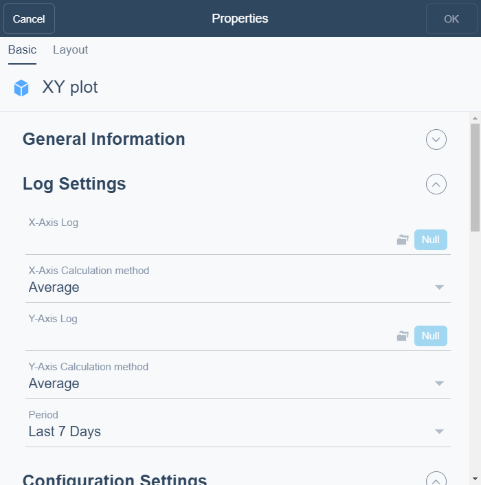
Use the XY Plot Properties dialog box to configure and edit a XY plot.

|
Component |
Description |
|
X-Axis Log |
Enter log you want to display on the x-axis. |
|
X-Axis Calculation method |
Select the calculation method for the X-Axis. |
|
Y-Axis Log |
Enter the log you want to display on the y-axis. |
|
Y-Axis Calculation method |
Select the calculation method for the Y-axis. |
|
Period |
Select the period you want to display. |
|
Calculated Period |
Select the time span for which the calculation method is to be executed. |
|
Scatter |
Select to display all values as individual points in the diagram. For more information, see XY Plot . |
|
Contour |
Select to display a contour map of the correlation of values. For more information, see XY Plot . |
|
Gridlines |
Select to display gridlines in the diagram. |
|
Linear Regression Line |
Select to display a linear regression line. For more information, see XY Plot . |
|
Polynomial Regression Curve |
Select to display a polynomial regression line. For more information, see XY Plot . |
|
Caption |
Type a caption for the widget. |
|
Caption Link |
Select to make a link to an object that is relevant to the values that are displayed in the widget. |
|
Show Period |
Select to display the period as a legend. |
|
X-Axis Caption |
Enter a caption for the X-axis. |
|
Y-Axis Caption |
Enter a caption for the Y-axis. |
|
Point Color |
Select the color for the points in the diagram. For more information, see XY Plot . |
|
Inner Contour Color |
Select the inner color for a contour map in the diagram. For more information, see XY Plot . |
|
Outer Contour Color |
Select the outer color for a contour map in the diagram. For more information, see XY Plot . |
|
Line Color |
Select the color for a linear regression line in the diagram. For more information, see XY Plot . |
|
X-Axis Minimum |
Select the X-axis minimum. |
|
X-Axis Maximum |
Select the X-axis maximum. |
|
Y-Axis Minimum |
Select the Y-axis minimum. |
|
Y-Axis Maximum |
Select the Y-axis maximum. |
|
Decimals |
Select the number of decimals you want to display. |
 Dashboard Widgets
 XY Plot
 Widget Dialog Box – Layout Tab