User Interface
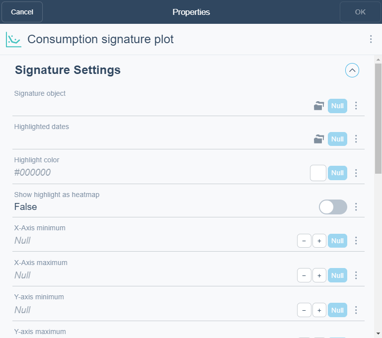
Consumption Signature Plot Widget Dialog Box
Use the Consumption Signature Plot Widget dialog box to configure and edit a consumption signature plot widget.

|
Component |
Description |
|
Signature object |
Select the consumption signature you want to display in the widget. |
|
Highlighted dates |
Select a calendar that defines the day that have a differnt color from the one in the signature curve. |
|
Highlight color |
Enter the number of bars you want to display in the chart. |
|
Show highlight as heatmap |
Select True to display the plotted information as a heat map. |
|
X -axis minimum |
Enter the Y-axis minimum.
|
|
X-axis maximum |
Enter the Y-axis maximum. |
|
Y-axis minimum |
Enter the Y-axis minimum. |
|
Y-axis maximum |
Enter the Y-axis maximum. |
|
Decimals |
Select the number of decimals you want to display. |
|
Caption |
Type a caption for the widget. |
|
Caption link |
Select to make a link to an object that is relevant to the values that are displayed in the widget. |
|
Show legend |
Click True to display the name and color of the trend log in the widget. |
|
Show alarm limits |
Click True to show alarm limits. |
|
Alarm limit color |
Select the color for the alarm limits. |
|
Show expected line |
Select True to display the expected consumption signature line. |
|
Show gridlines |
Click True to show gridlines. |
|
Show period |
Click True to show period. |
 Dashboard Widgets
 XY Plot
 Widget Dialog Box – Layout Tab